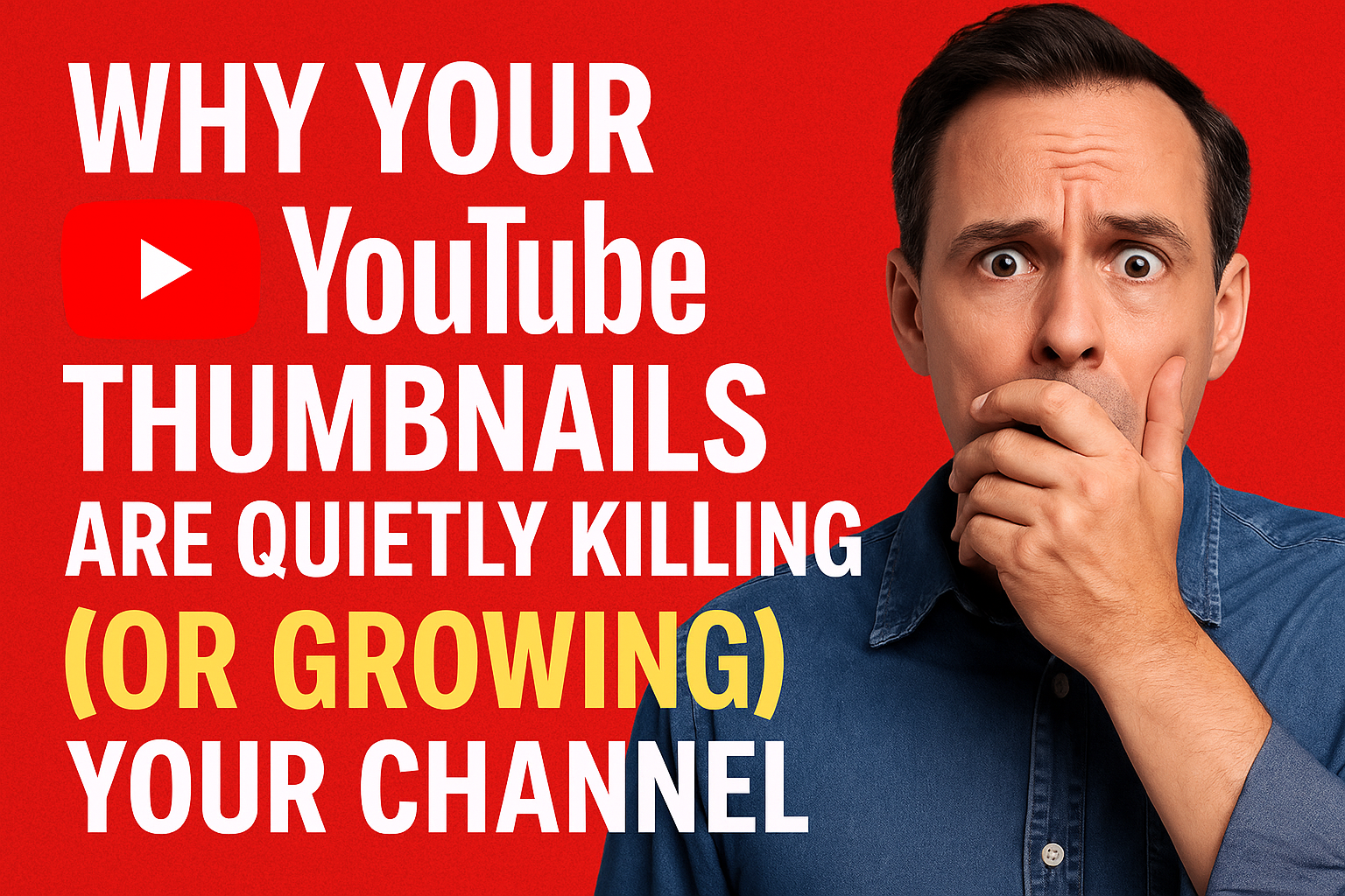
You ever scroll through YouTube and feel like every video is screaming for attention — bold text, wide-eyed faces, neon borders — and then you see one with no thumbnail at all? Just a blurry frame of someone mid-blink? Yeah… that’s how most videos die quietly in the algorithm graveyard.
Let’s be real — a thumbnail is not just a picture. It’s your video’s first impression, your handshake, and your billboard all rolled into one. Before a single second of your video plays, your thumbnail decides whether someone even gives you the time of day.
And here’s the kicker: it’s not just about looking good. It’s about being strategic.
The Technical Side of Thumbnails (AKA: Why Data Actually Cares About Design)
YouTube’s algorithm is obsessed with one metric above all: click-through rate (CTR).
CTR = how many people saw your video versus how many actually clicked it.
If your video thumbnail makes people stop scrolling and tap, YouTube rewards you with more impressions. If it doesn’t… the algorithm quietly moves on like an ex who’s already over it.
Here’s what affects your thumbnail performance on the tech side:
-
Contrast & Composition: Bright, clean imagery stands out. Use color contrast to separate your subject from the background and guide the eye to what matters.
-
Readable Text (but not too much): You’ve got two seconds to make sense. Use 3–5 impactful words max — think “Before You Quit,” “The Truth About SEO,” or “$0 to $10K.”
-
Consistency: When your thumbnails share a visual theme — colors, fonts, layout — you build recognition. Viewers start spotting your content from the corner of their eye, even before reading the title.
-
A/B Testing: YouTube now lets you test thumbnails for a reason. Try variations and let the numbers tell you what hits.
At Media Factory South, we live in this space. We’ve seen clients double their CTR just from updating their thumbnails — no title change, no new upload, just smarter visuals that align with their brand.
The Psychology Behind the Click
Now let’s talk about the fun part — the human brain.
Your brain scrolls through feeds the same way you walk down a grocery aisle. It ignores 99% of what’s there until something visually interrupts your pattern. That’s what a good thumbnail does — it interrupts your brain’s auto-scroll long enough to whisper, “Hey, this one looks interesting.”
1. Emotion Wins Every Time
Faces showing genuine emotion (shock, joy, disbelief) are processed by the brain faster than text. That’s why so many thumbnails feature expressive close-ups — not vanity, just neuroscience.
2. Curiosity Is Currency
The goal isn’t to tell the whole story. It’s to spark curiosity. A thumbnail that teases a question — “Wait, how did they do that?” — triggers the same dopamine response your brain gets from solving a mystery. That’s why people binge YouTube at 1 a.m.
3. Color Psychology Matters
Red grabs attention. Blue builds trust. Yellow makes people feel energized. Strategic color use creates subconscious emotional cues that help people decide whether to click.
Combine all three, and you’ve got yourself a mini-marketing machine — every pixel working toward one purpose: getting that click.
The Silent Killers of Engagement
If you’re uploading videos and letting YouTube “auto-pick” a thumbnail… my friend, you’re flying blind.
Those random stills aren’t optimized. They’re often blurry, mid-motion, or totally off-brand. It’s like showing up to a job interview in your pajamas and wondering why you didn’t get the gig.
Other common mistakes we see:
-
Too much text clutter
-
Confusing visuals that don’t match the video
-
Clickbait that betrays trust (short-term clicks, long-term damage)
-
Inconsistent branding that makes your channel look like a thrift shop of random ideas
Bottom line — if you want to be taken seriously, your thumbnails have to look like you take your brand seriously.
Every Pixel Has a Purpose
When we create video content at Media Factory South, thumbnails aren’t an afterthought — they’re part of the storytelling strategy.
We design them with purpose:
-
Emotion that connects.
-
Color that aligns.
-
Text that teases, not tells.
-
Branding that builds recognition across every upload.
A great thumbnail doesn’t just earn clicks — it starts a relationship with your audience before the first second of video even plays.
So next time you hit “upload,” don’t skip the thumbnail.
You might be skipping your audience.
Ready to Make Every Click Count?
Whether you’re creating content or managing a brand, every thumbnail, caption, and clip tells a story. At Media Factory South, we help you make that story impossible to scroll past.
Whether you’re ready to dive in or just want to talk shop, we’d love to connect.
👉 Reach out to us online
📞 Schedule a call
📱 Check out our latest work on socials
📬 And don’t forget to subscribe to our newsletter for tips, trends, and tools to keep your brand ahead of the curve.
Our Services
-
Social Media Management
-
Website Development & Design
-
SEO Packages
-
Paid Marketing Campaigns
-
Email Campaign Management
-
Custom Content Creation Sessions (worldwide)